Crafting a Brand Strategy for Mortgage365
Mortgage365, a forward-thinking technology platform for mortgage lenders and loan officers, approached our marketing agency seeking assistance in developing a robust brand strategy. While they had an innovative mortgage lending system in place, they lacked a cohesive brand identity and strategy to effectively promote it to their target audience.

Challenges
Lack of a Defined Brand Strategy and Cohesive Messaging
Mortgage365 needed clear and compelling brand messaging that would resonate with their target audience of lenders and loan officers.
Limited Visual Brand Identity
Mortgage365 needed clear and compelling brand messaging that would resonate with their target audience of lenders and loan officers.
Need for a Compelling Value Proposition
Mortgage365 required a strong value proposition that would effectively communicate the benefits of their platform to potential customers.


Our Approach
Comprehensive Research
We conducted in-depth research into the mortgage lending industry, including market trends, competitor analysis, and customer insights.
Brand Strategy Development
Based on our research and workshop findings, we developed a comprehensive brand strategy that aligned with Mortgage365's goals and values.
Brand Messaging
We crafted compelling brand messaging that effectively communicated Mortgage365's value proposition and benefits to lenders and loan officers.
Collaborative Workshops
We facilitated workshops with key stakeholders at Mortgage365 to identify their unique value proposition, target audience, and brand positioning.
Visual Identity Creation
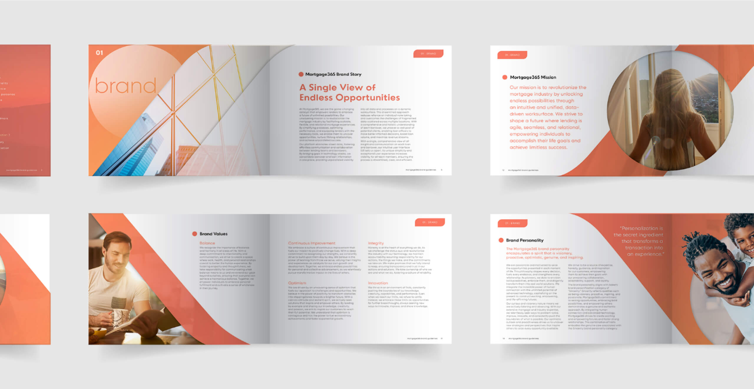
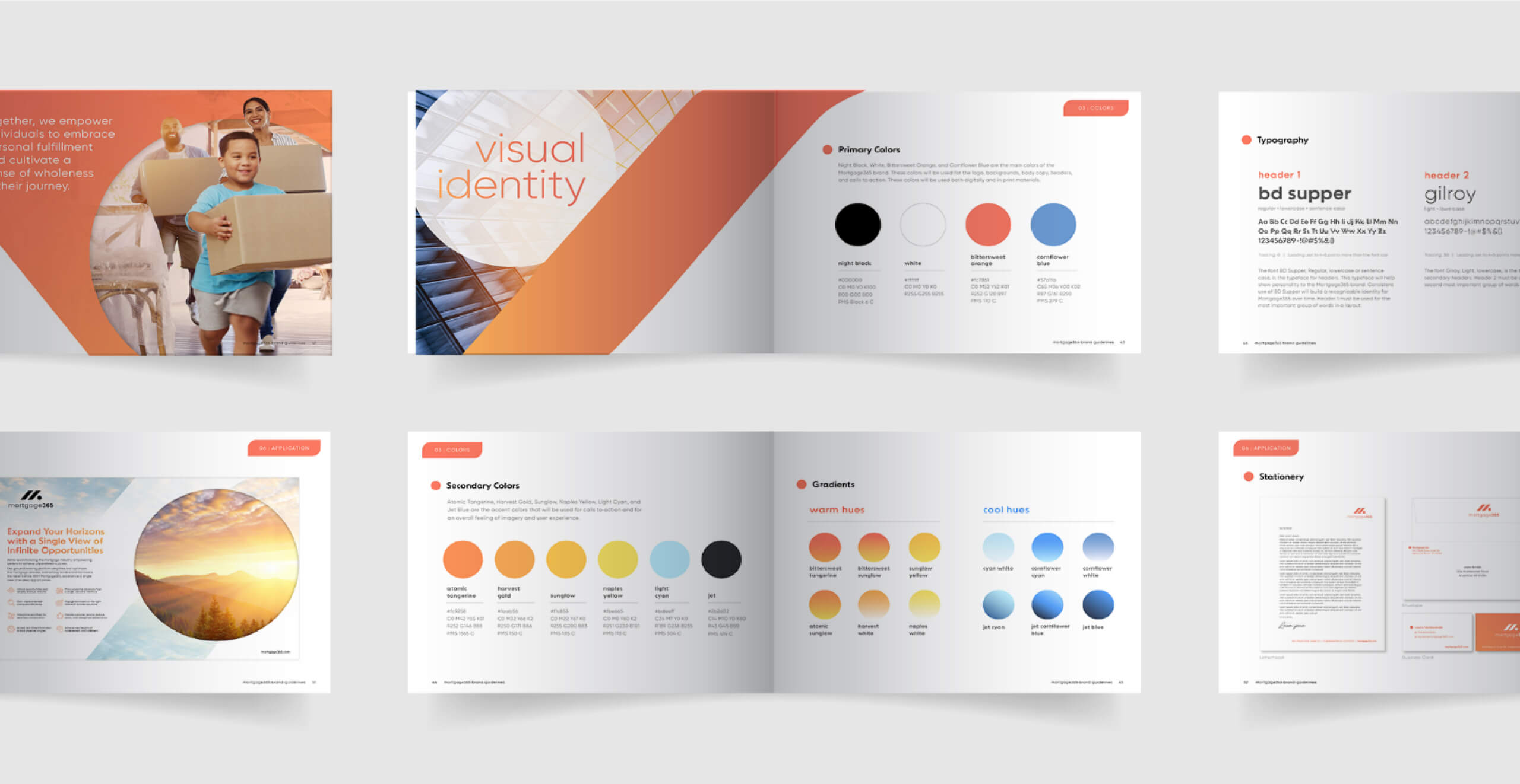
We created a visually striking identity for Mortgage365, including a logo, color palette, and visual elements that reflected their brand values and resonated with their target audience.





Results
Value Proposition Clarification
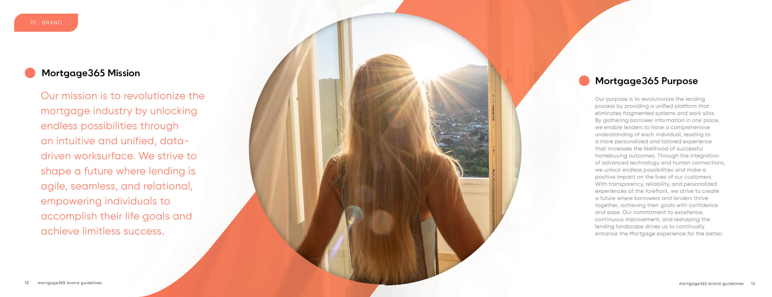
Our first step was to clearly define Mortgage365's value proposition. We articulated how their platform addressed the specific needs and challenges faced by lenders and loan officers, such as streamlining the mortgage process, improving efficiency, and enhancing customer experience.


Cohesive Brand Messaging
Crafting compelling brand messaging was essential to effectively communicate Mortgage365's value proposition and benefits to lenders and loan officers. We focused on developing messaging that resonated with their target audience and addressed their pain points while highlighting the unique features and benefits of the Mortgage365 platform.
Key Messaging Points
We identified key messaging points that emphasized Mortgage365's core strengths and advantages. These included features such as seamless data integration, comprehensive borrower insights, and personalized loan solutions tailored to individual needs.
Benefit Communication
We crafted messaging that highlighted the tangible benefits of using Mortgage365, such as increased productivity, faster loan processing times, reduced administrative burden, and improved customer satisfaction. We emphasized how these benefits translated into real value for lenders and loan officers in terms of time saved, revenue growth, and competitive advantage.
Differentiation Strategy
We developed messaging that underscored Mortgage365's unique selling propositions and points of differentiation compared to competitors. This included highlighting their advanced technology capabilities, user-friendly interface, and commitment to personalized service and support.
Emotional Appeal
In addition to highlighting the practical benefits, we incorporated elements of emotional appeal into the messaging to resonate with the aspirations and goals of lenders and loan officers. We conveyed a sense of empowerment, opportunity, and optimism, framing Mortgage365 as a partner in their journey towards success and professional fulfillment.


Strong Brand Visibility
Logo Creation
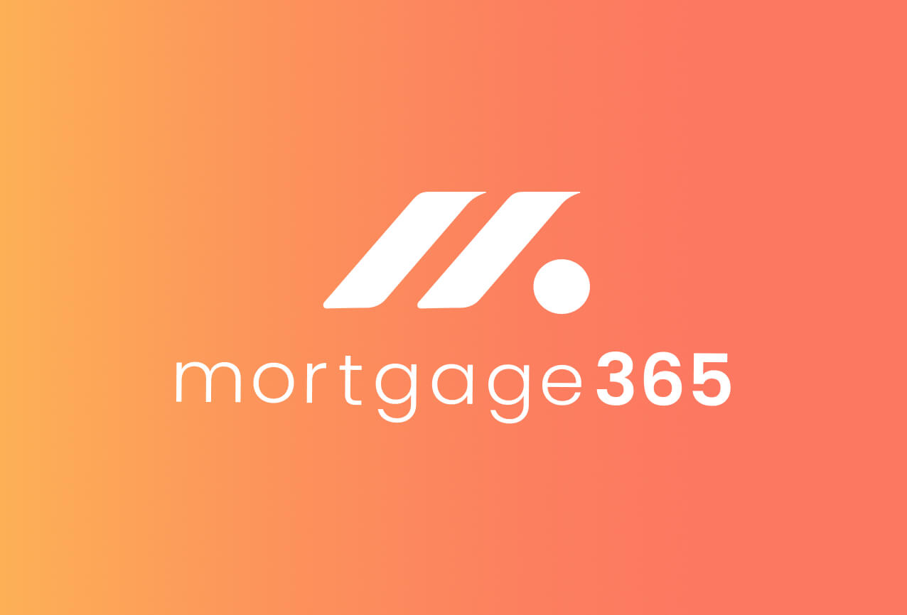
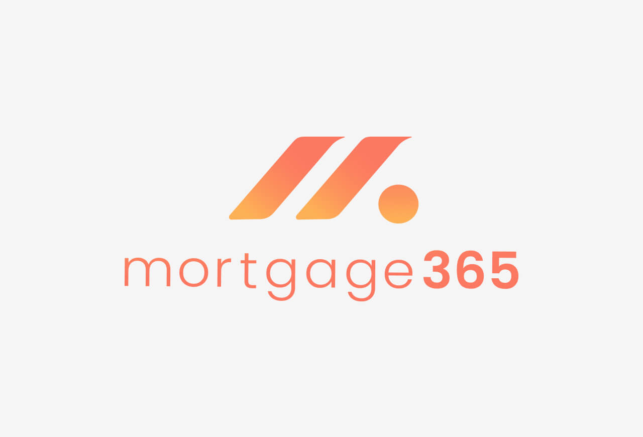
The creation of the logo was driven by a desire to encapsulate Mortgage365's essence and values while resonating with its target audience of lenders and loan officers. The design process was deliberate and thoughtful, with each element serving a specific purpose. The letter "M" was chosen as the focal point to represent the brand's name and initial, providing a clear and memorable identifier. The two slanted lines forming the "M" not only created negative space symbolizing a single view of endless opportunities but also represented relationships, collaboration, and unity. The precise alignment and uniformity of these lines emphasized balance and harmony, reinforcing the brand's commitment to coherence and synergy. Additionally, the direction of the lines and the subtle right flicks at the top conveyed a sense of forward progress and optimism, guiding users towards a brighter future. The incorporation of circles, universally recognized symbols of infinity, further reinforced the idea of endless possibilities and potential for growth.
Color Choices
The color palette was carefully selected to evoke the colors of a new day and a bright sunrise, reflecting Mortgage365's mission to illuminate the path to success for its clients. White symbolized purity and clarity, while shades of orange, gold, and yellow represented warmth, energy, and optimism. These vibrant hues not only captured attention but also conveyed a sense of positivity and vitality, aligning with the brand's aspirational messaging. By combining these elements, the logo and color palette effectively communicated Mortgage365's brand identity and values, leaving a lasting impression on its audience and distinguishing it from competitors in the market.






Conclusion
The creation of the logo was driven by a desire to encapsulate Mortgage365's essence and values while resonating with its target audience of lenders and loan officers. The design process was deliberate and thoughtful, with each element serving a specific purpose. The letter "M" was chosen as the focal point to represent the brand's name and initial, providing a clear and memorable identifier. The two slanted lines forming the "M" not only created negative space symbolizing a single view of endless opportunities but also represented relationships, collaboration, and unity. The precise alignment and uniformity of these lines emphasized balance and harmony, reinforcing the brand's commitment to coherence and synergy. Additionally, the direction of the lines and the subtle right flicks at the top conveyed a sense of forward progress and optimism, guiding users towards a brighter future. The incorporation of circles, universally recognized symbols of infinity, further reinforced the idea of endless possibilities and potential for growth.

